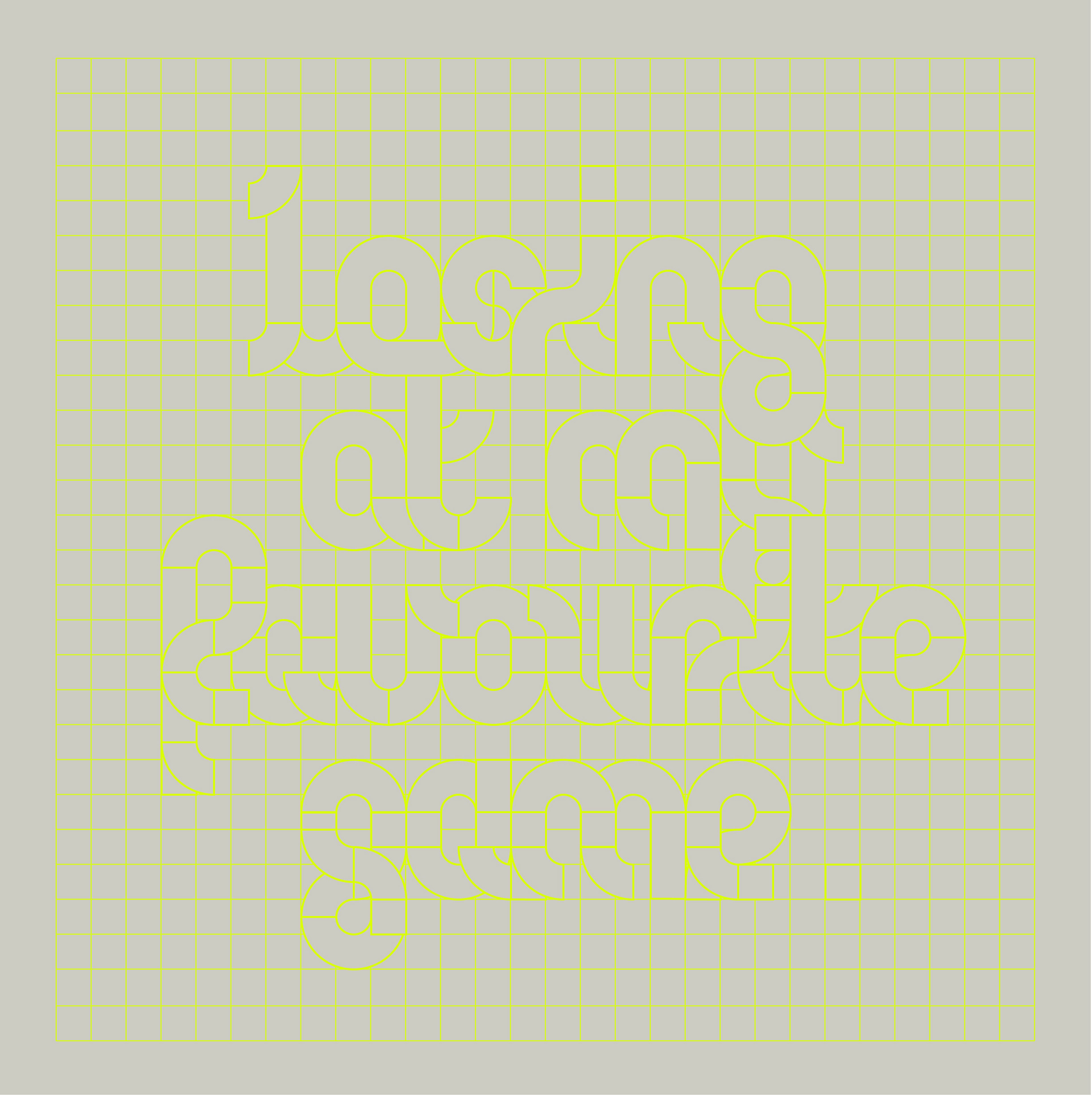
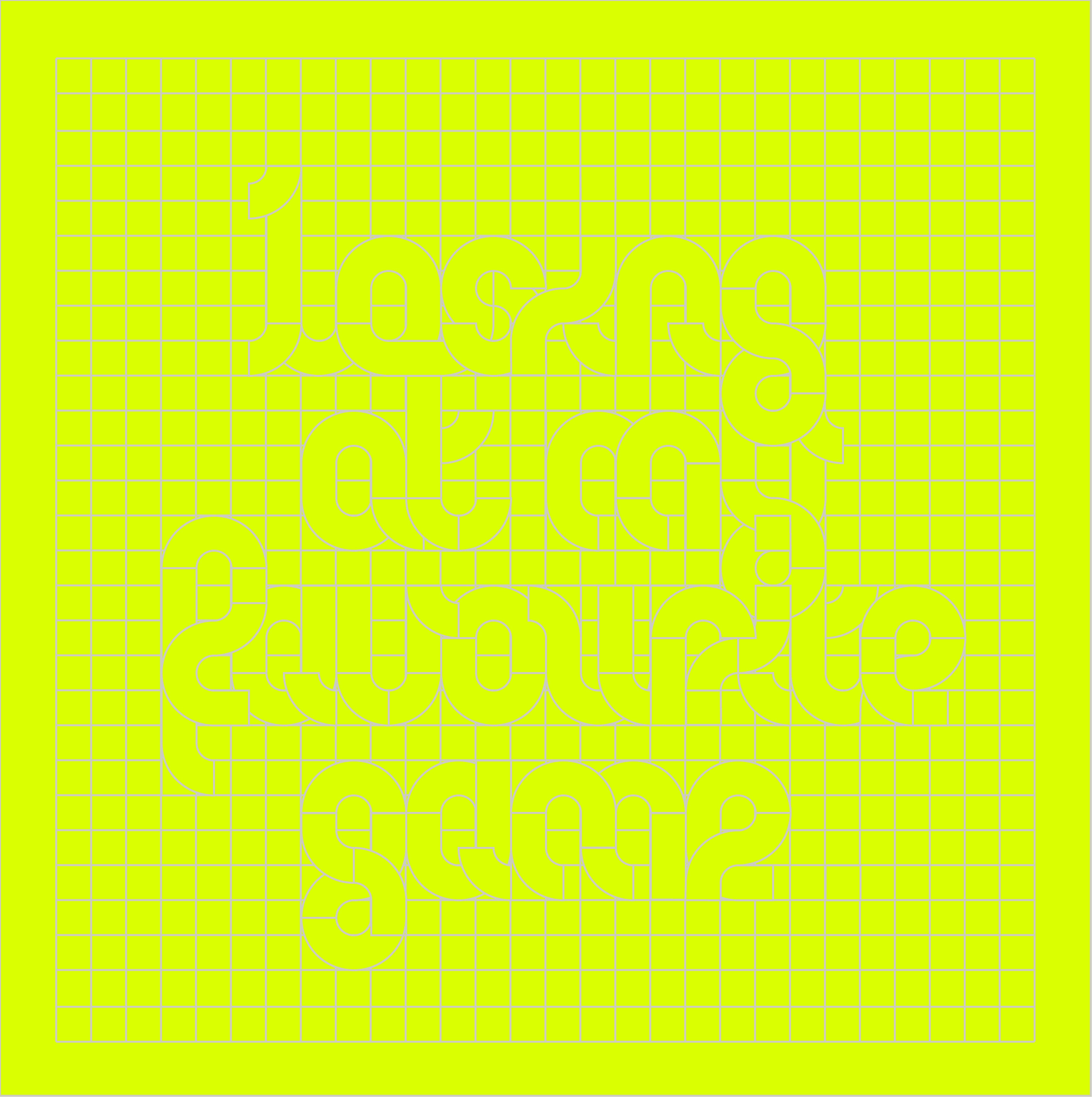
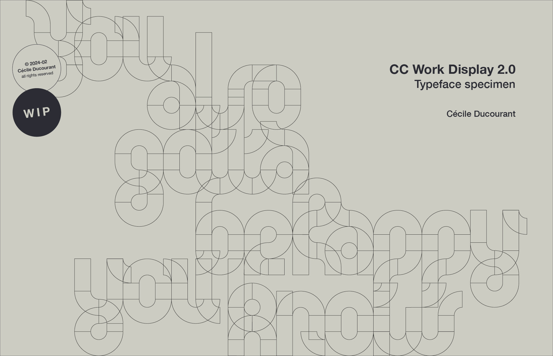
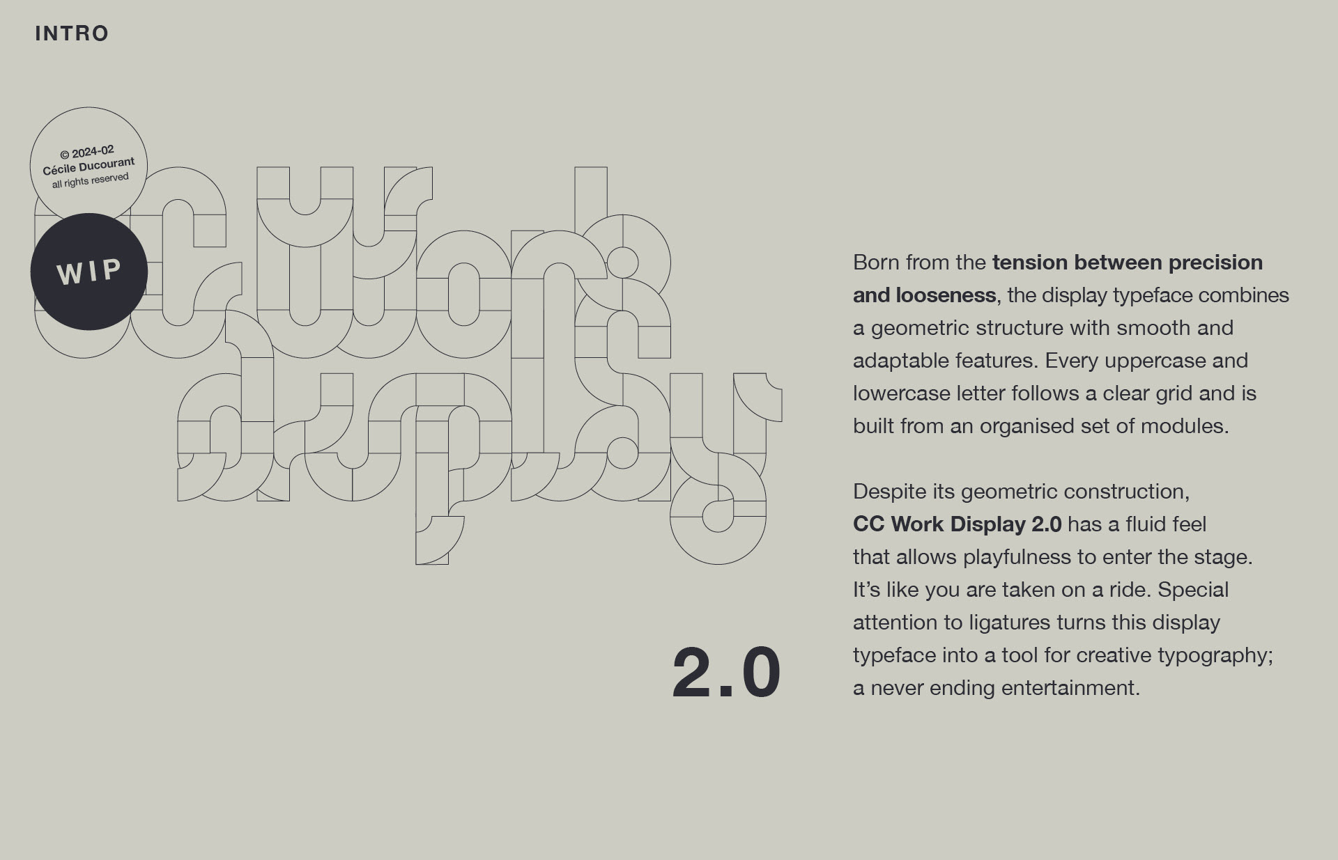
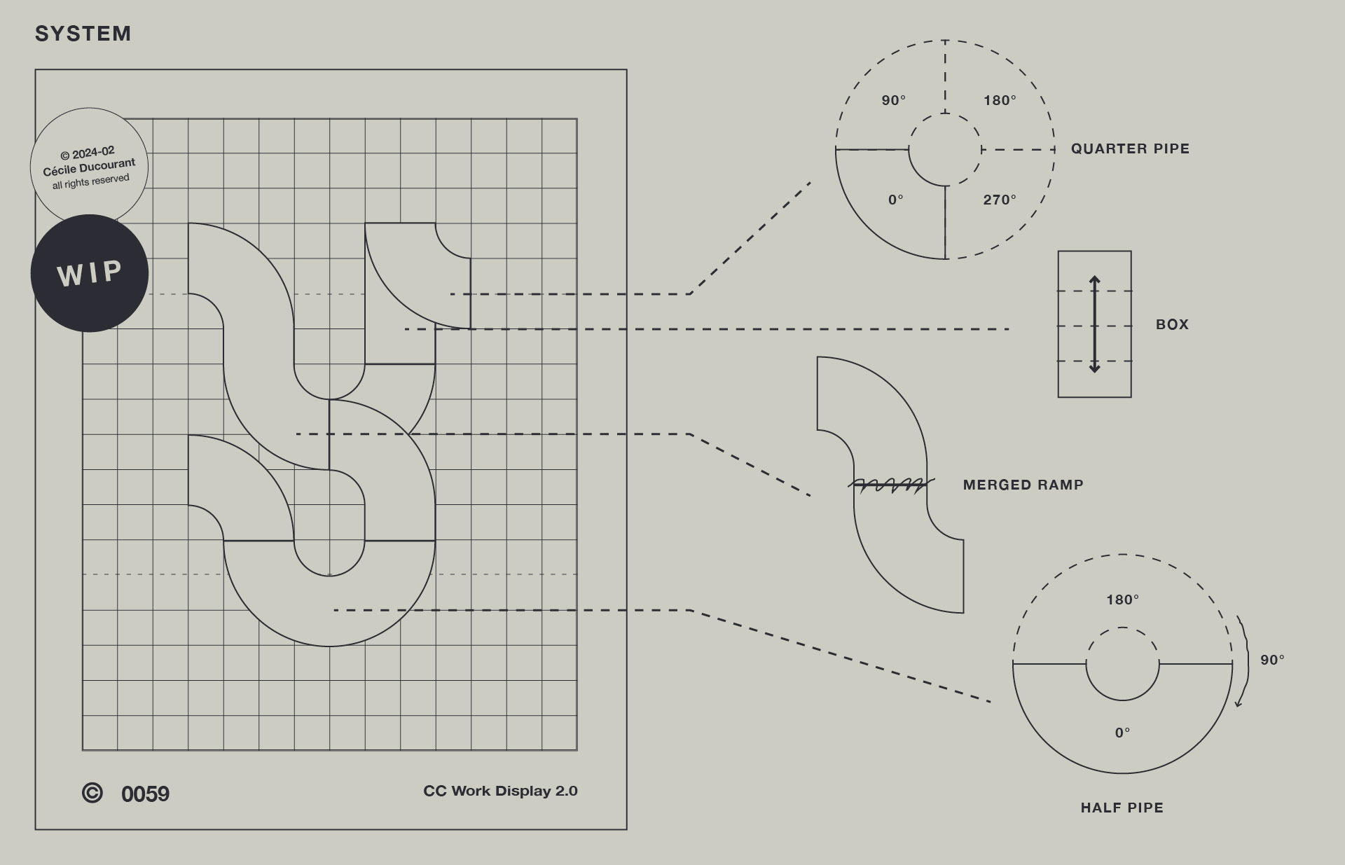
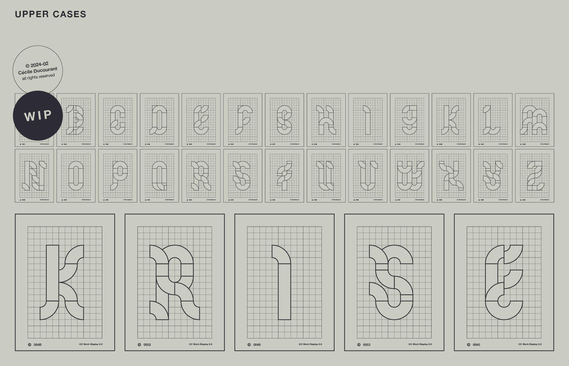
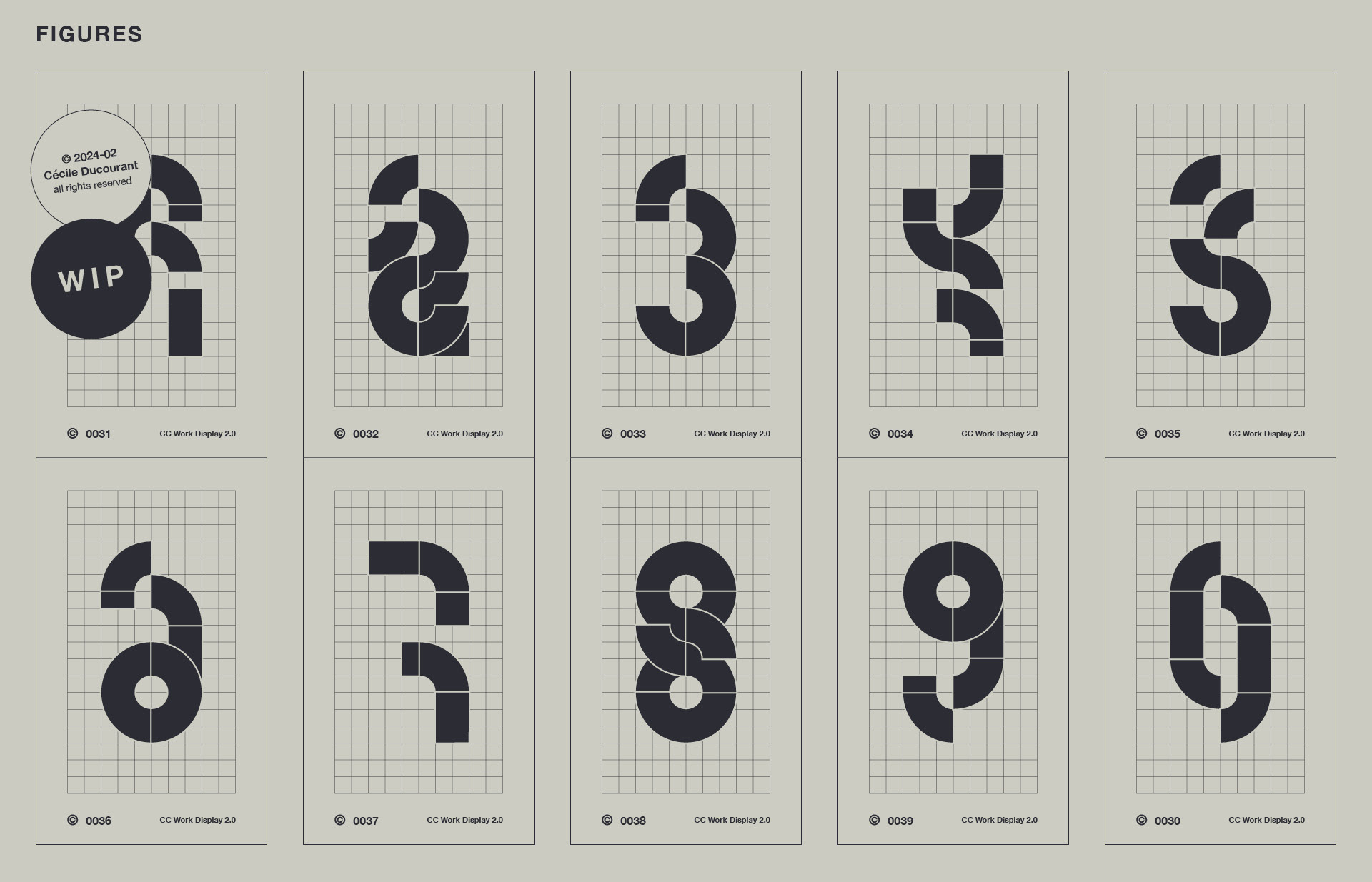
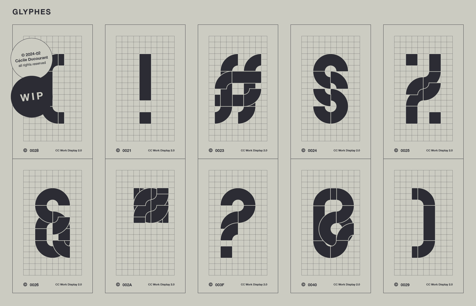
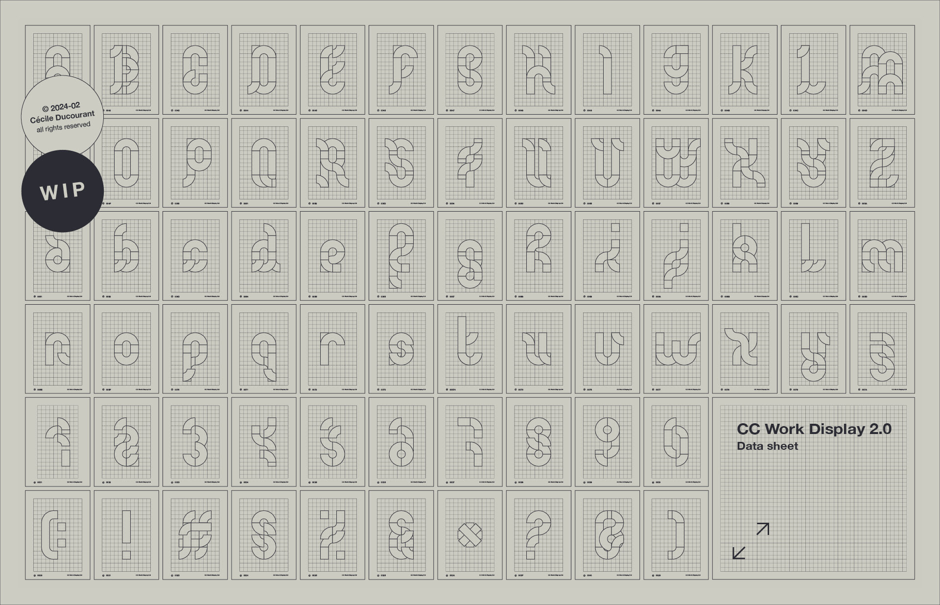
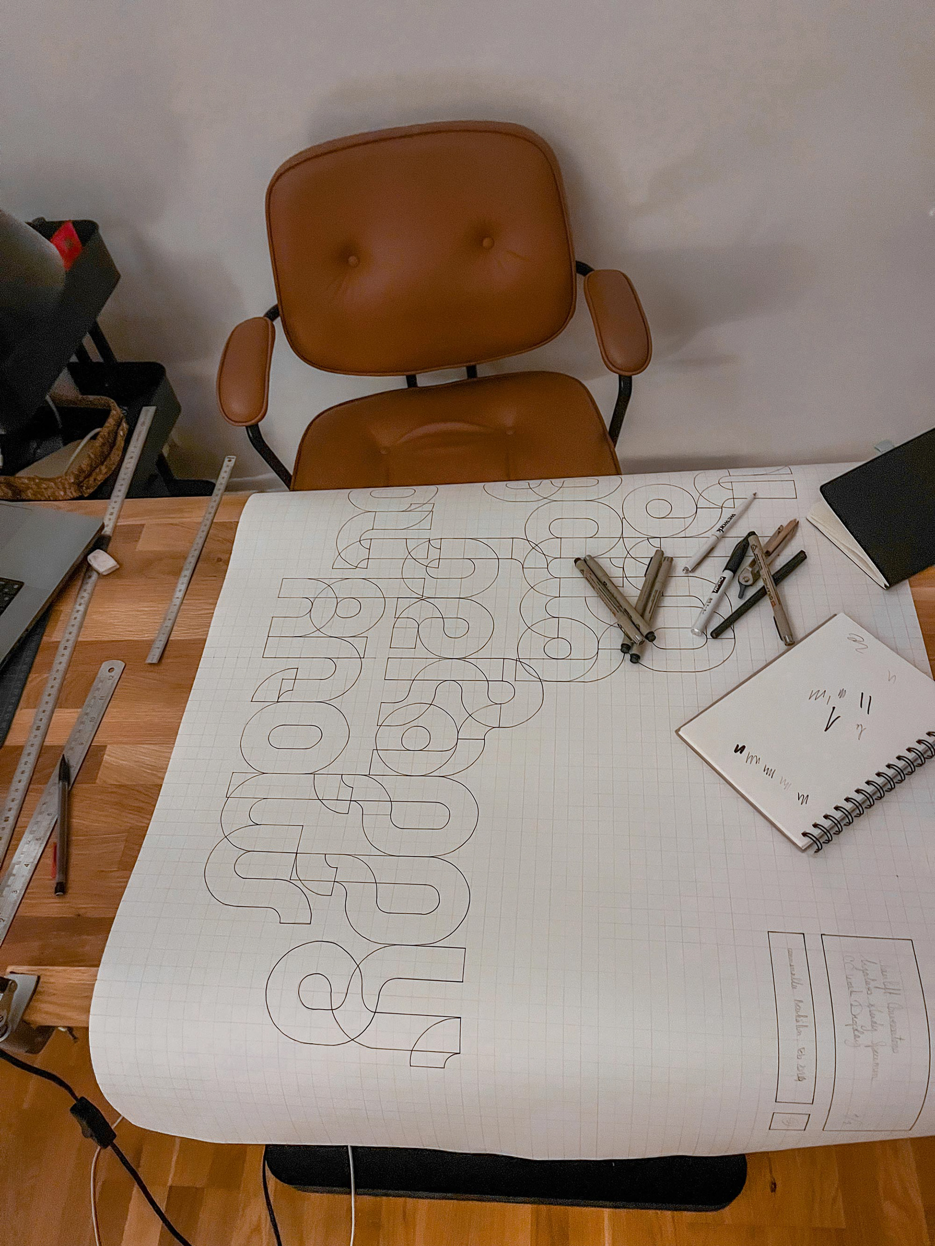
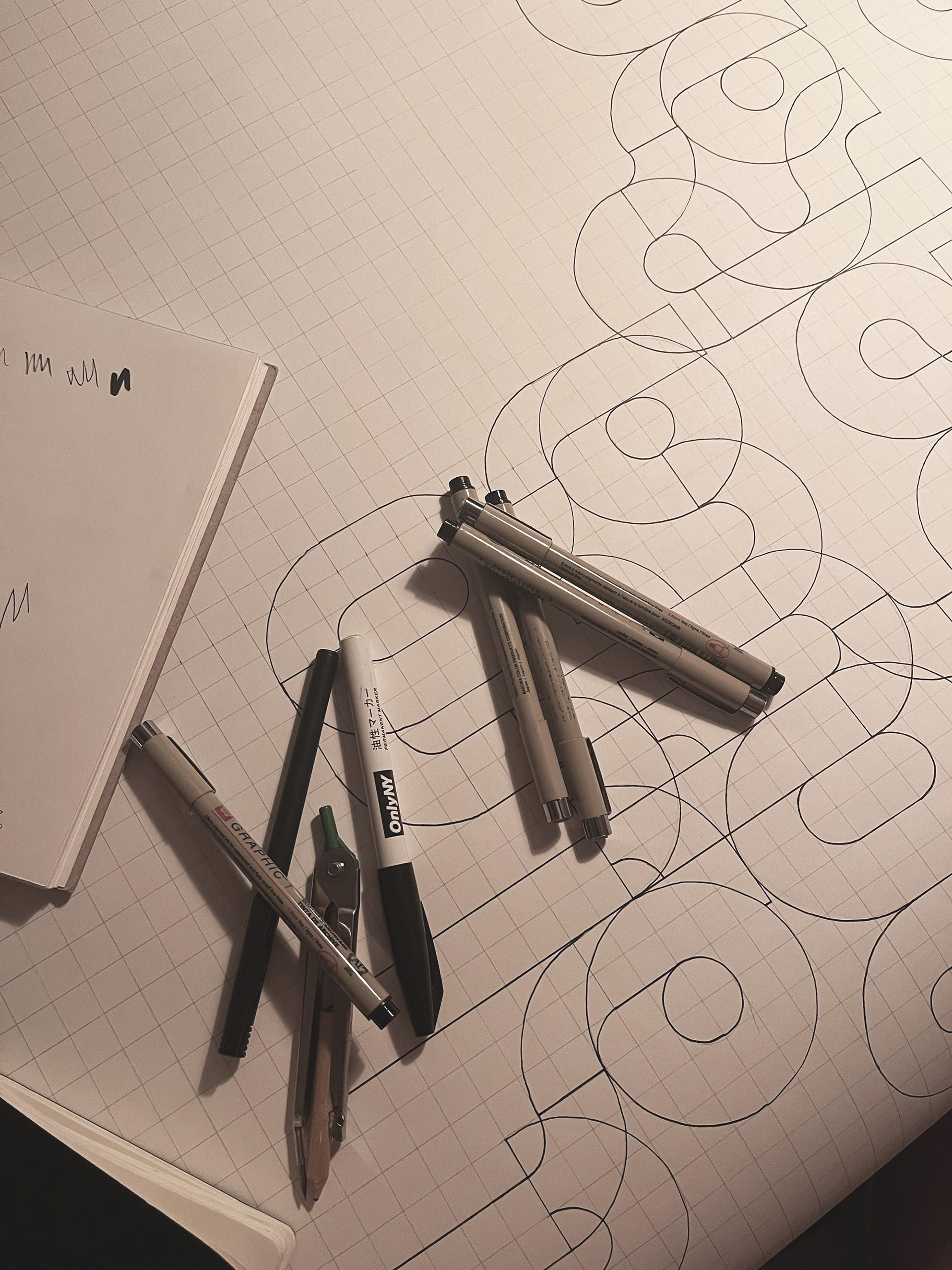
Work Display 1.0 was born a couple years ago, when the pandemic hit the world with its unexpected gift of time. I ever since kept on coming back to the same shapes yet not finding a proper way to articulate a cohesive whole. I recently urged to find a systematic way to enlighten it. By turning the modules around in every possible way and fabricating new connections, I created a fluid ensemble gathering things I love most about design: Grids & Systems. Welcome CC Work Display 2.0.
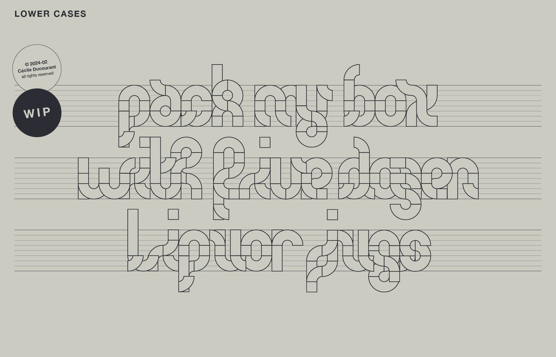
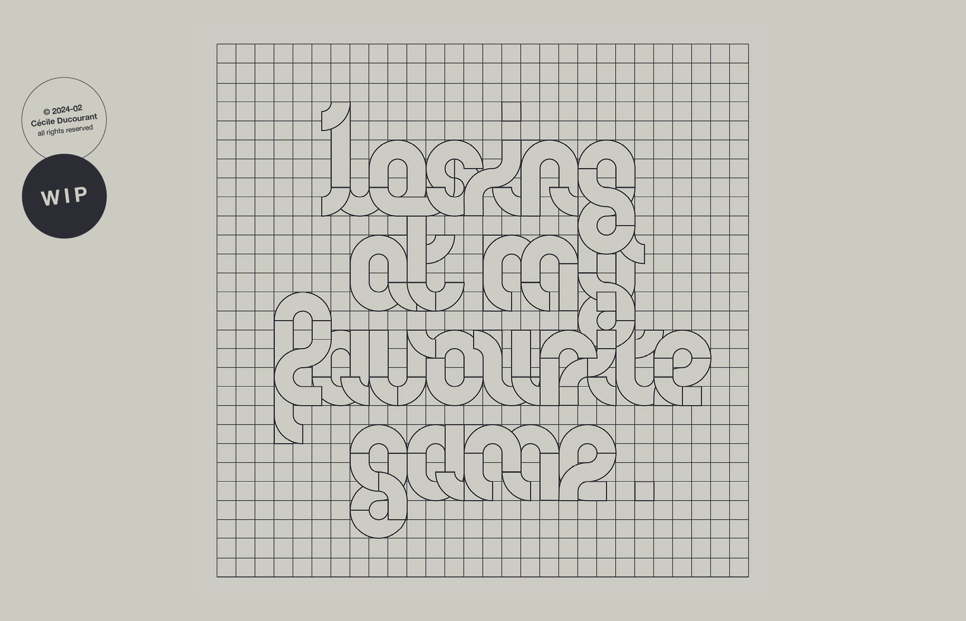
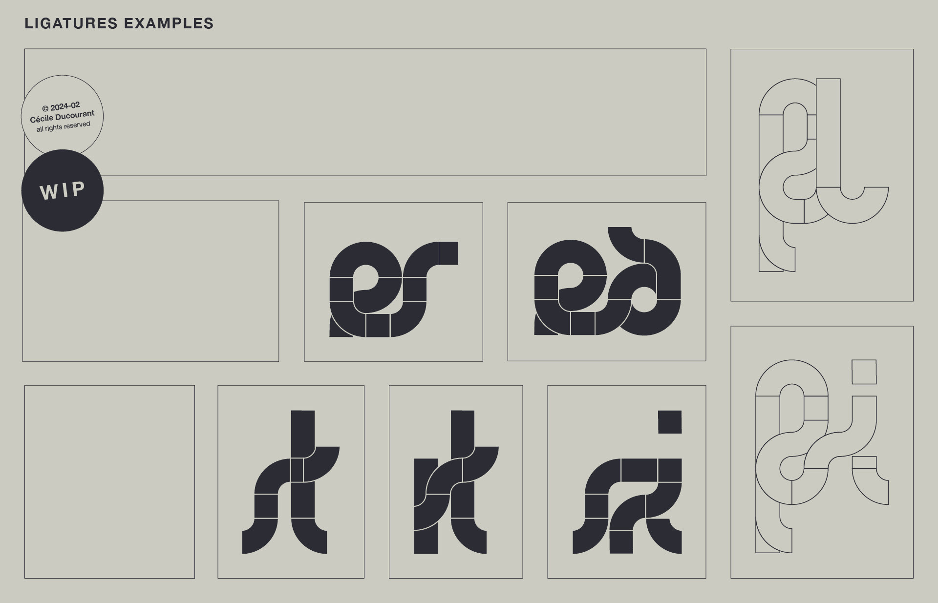
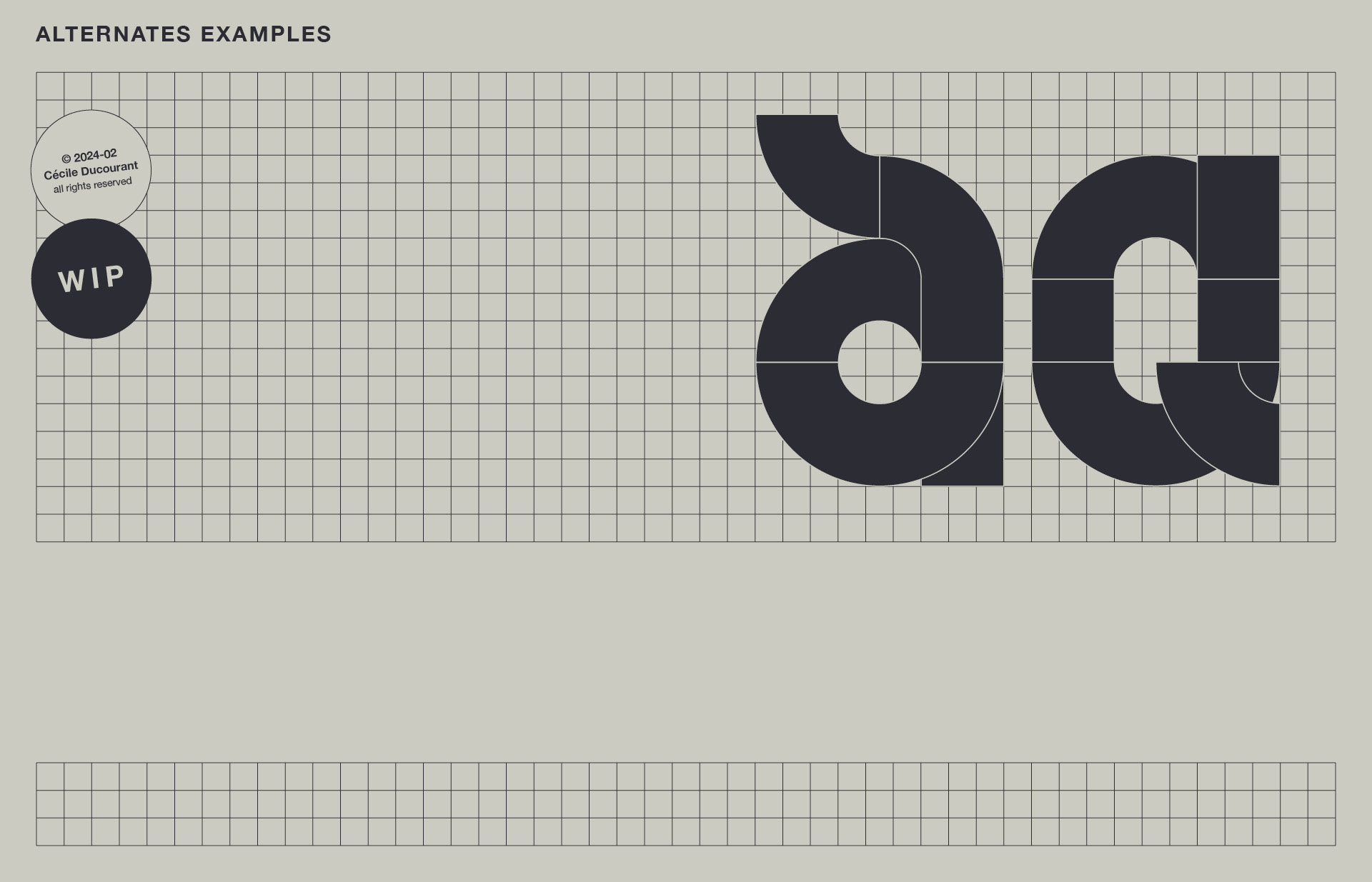
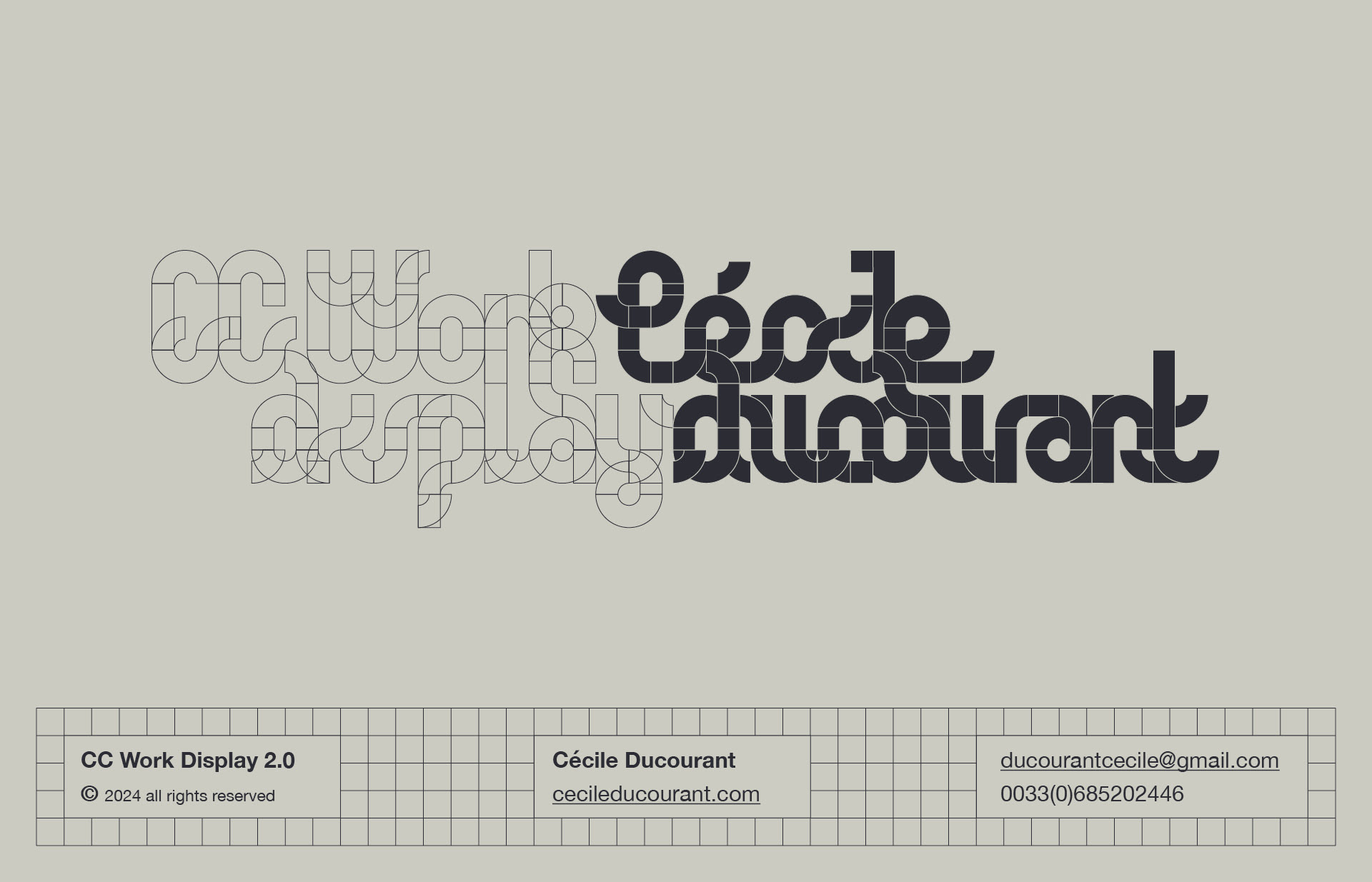
Born from the tension between precision and looseness, the display typeface combines a geometric structure with smooth and adaptable features. Every uppercase and lowercase letter follows a clear grid and is build from an organised set of modules. Despite its geometric construction, CC Work Display 2.0 has a fluid feel that allows playfulness to enter the stage. It's like you are taken on a cruise. Special attention to ligatures turns this display typeface into a tool for creative typography; a never ending entertainment.
